Use Case: SchabrechtsK.be
To build this site I used my User Experience Design training to determine what I exactly needed to build.
The following is a summary of that research document.
Problem Definition
As a freelancer, I need a platform on which I can share my knowledge and activities. I can use this to also attract potential clients.
The first problem requires that I have the ability to log all my knowledge and all my activities. These include articles, the vlog, and a potential podcast. It needs to be easy to search this blog and find info on different topics.
The second problem requires a platform to find my speaking and workshop gigs. With a quick overview to see when and where the next upcoming gig is.
The last problem is a combination of this all. If I can showcase my knowledge and my gigs than potential clients can see what I know and what I’m up to.
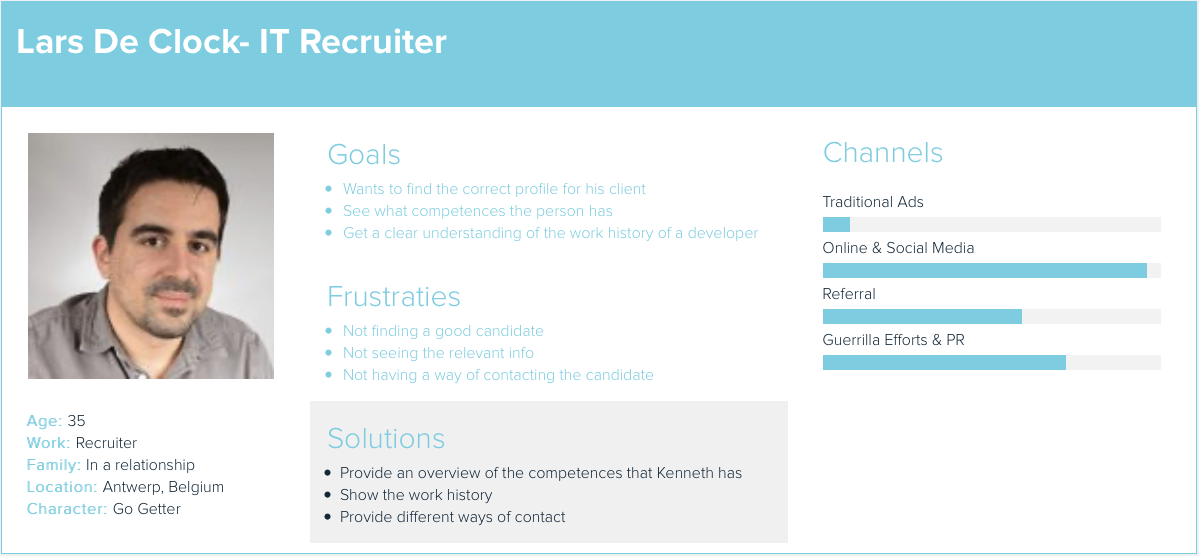
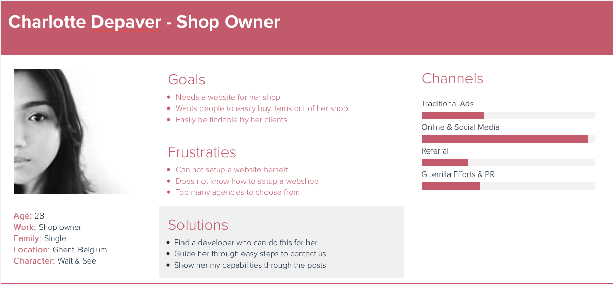
Personas
The profiles that this site is targeting is a mix of different types. We have developers who want to learn more about the challenges I face when developing and how I solved them. And then there are potential clients who want to be able to see what my capabilities are.
For these types, we create different personas. These are representations of people who could visit this site.
Would it not be nice if?
“Would it not be nice if …” is a brainstorming section about the extra possibilities that the site can have. These are actions or ideas that would add extra value to the site but are not a required part of the first iteration. In this topic, we can go as far and wide as we want.
- A blogpost would be automatically shared to all social media
- A new speaking gig or workshop would be automatically shared to all social media
- There is an overview of all tools I use, grouped by type
- A webshop with branded material
- Comments on posts give a notification in Slack
- People could sponsor the author
As an exercise, I took one of these ideas and fleshed it out. As you can see at the end of the blog post I actually already implemented this idea.
People could sponsor the author
For my vlog, I already have a sponsoring mechanism in place. During that time I create a Ko-Fi page. I do not push this sponsoring type on the vlog, but it is present in the description.
There is a reason why I do not push this. It is because sponsorship in the development world can have a negative connotation. A little research was in order. I used Twitter to see what the community thought about it.
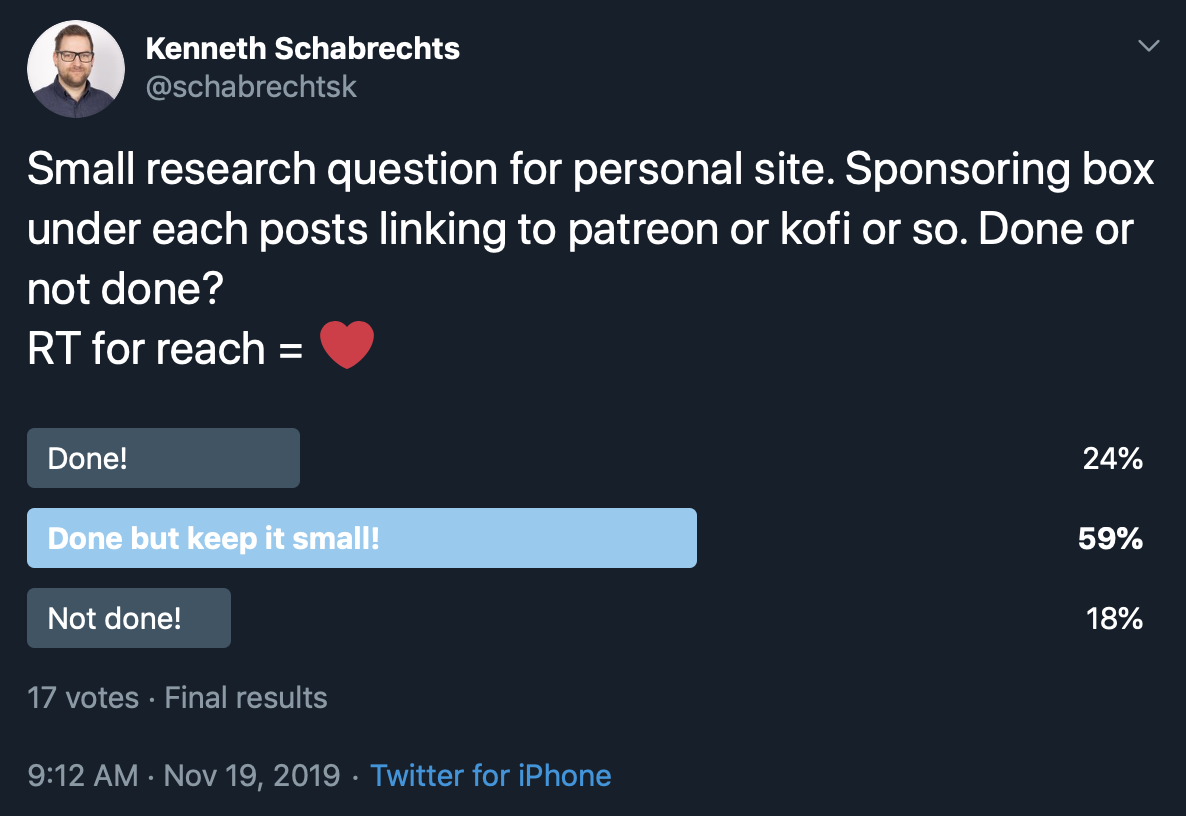
A whopping 59% says it is ok to do but to keep it small, another 24% says to go for it. This means we have a majority of 83% who think it is ok to add such a feature.
Herman Maes pointed out that it would only make sense in 1 case. If the content provided is self researched and self-written. There is no use in adding a support button when all the content provided is actually back-links to other blogs.

The next thing we need to decide is the text to use. Some options are:
- Support my work
- Support me on Ko-Fi
- Support
- Buy me a coffee
- Buy me a coffee (€ 3,00)
For the ease of use and clarity, we will start by using the Buy me a coffee button.
Competition Research
There are a lot of developers out there that have a website for their personal branding. The next part researches a few of these to see what works and does not work.
Amos
The first site that we have is the one from Amos. Amos is a developer who works in Go.
The thing that attracts here is the minimalism and simplicity that this site is built with.
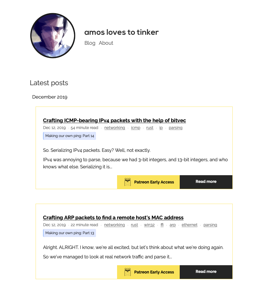
Another item that is interesting is Patreon support.
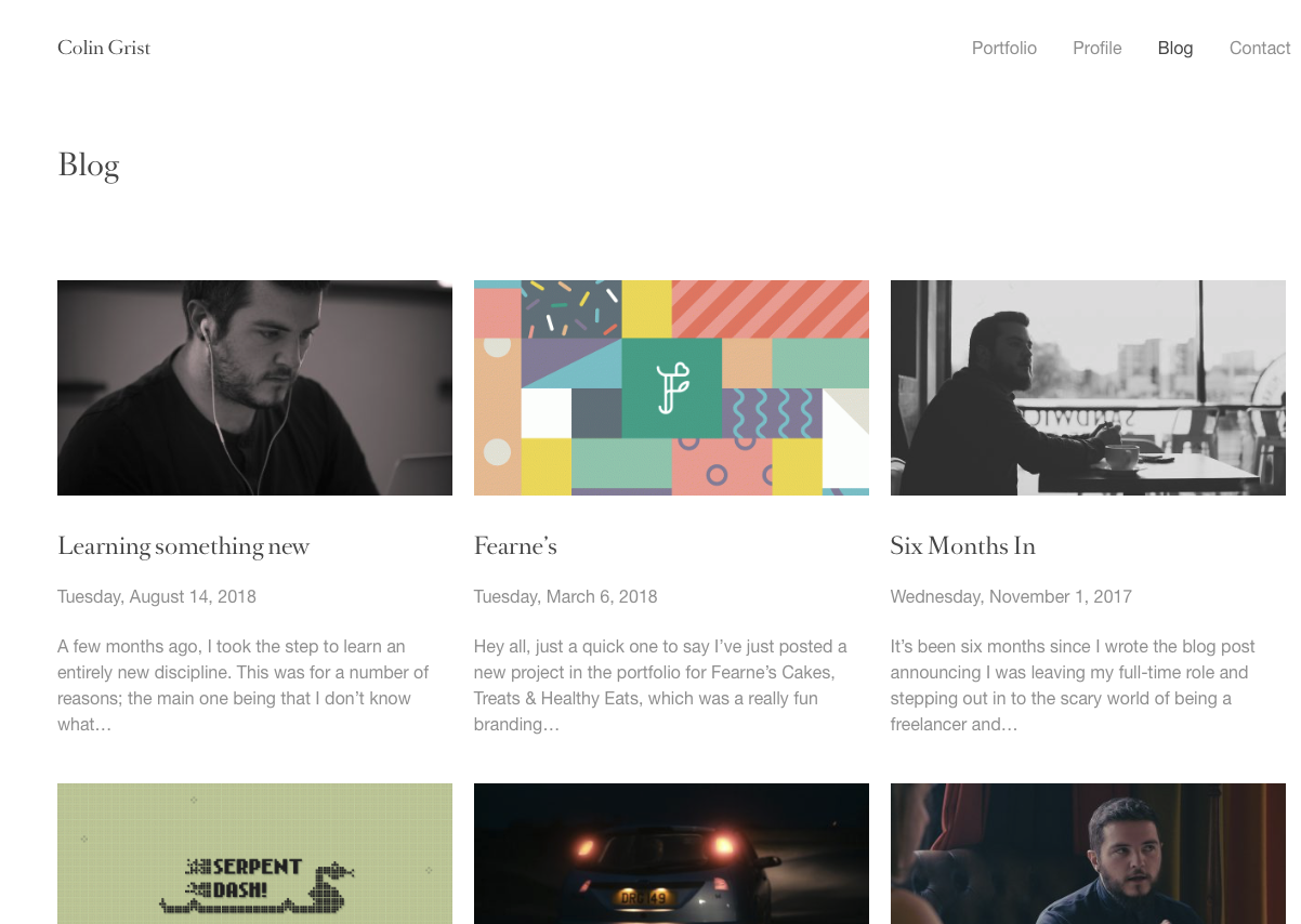
Colin Grist
Colin Grist is a designer and developer. The thing that struck me here is the way the blog overview has been build up.
The overview is build up with a featured image, the title, date, and a small excerpt. The end-user gets an easy and quick overview of the blogpost by date.
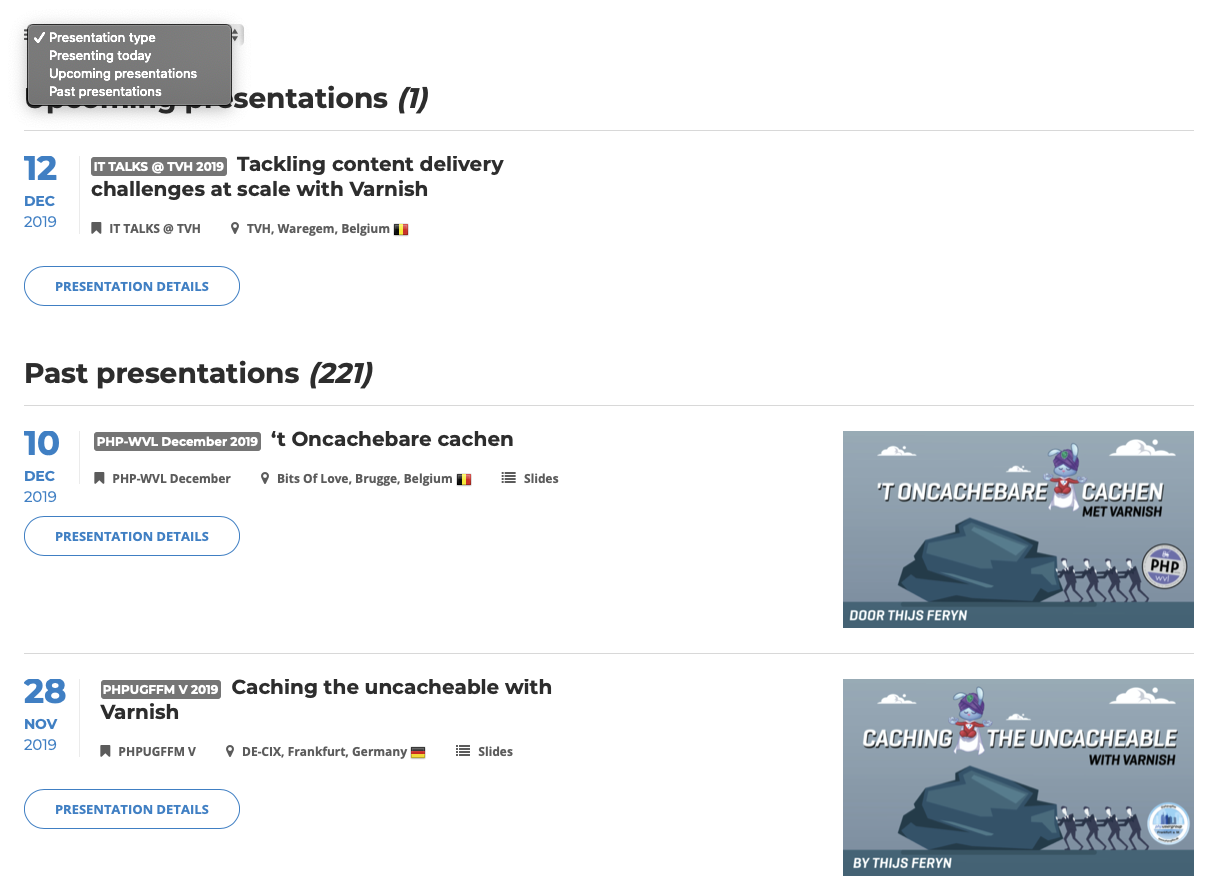
Thijs Feryn
Thijs Feryn is a “technical evangelist” at Varnish software. He does a lot of public speaking, is an author and hosts a vlog.
The part that interests the most here is the speaking page. Thijs presents his speaking gigs in a very nice and structured way. You can also choose whether you want to see the presentations of today, in the future or those in the past.
Each talk shows the date, the event, and the location. In the detail page, you can even book him.
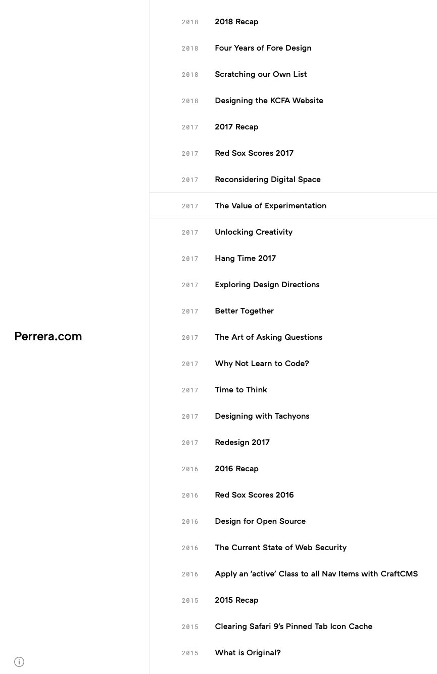
Perrera
Dan Perrera runs the Fore Design, a brand-driven visual communications studio.
He keeps his site unusual minimal. The only thing visible is the post titles and the publishing year. At the bottom, we can also see a little info icon that will popup info on the Fore Design studio. Very clean and minimal.
Card Sorting
Card sorting is a strategy where you write down functionality or data structures down on cards. Next, the cards are sorted according to rules set by the researcher. This is done by type of functionality or data, by importance, etc.
In this research document, we will handle the site structure and the categories. I’ve done both digitally.
Site structure
We’ll first think about what the needs are on the website:
- Blog / Notes
- Vlog (link to the vlog)
- About / Profile
- Contact
- Resume
- Speaking (Both schedule and booking)
Now that we have our list we can see what we can remove to simplify the list. For example, we can show our phone, email and social in our header and footer. This removes the need to have a contact page.
We can also integrate the Resume page into the About / Profile page. By providing a link to my resume or even showing it in there we can hide it away from the menu. We only have to make sure we keep it accessible within 4 clicks. We can also hide the whole resume since we do have a link to LinkedIn on the website.
One of the pages could also be our basic homepage. For this there are 3 obvious choices: About me, Blog or a custom homepage not related to any of this. If we take the custom homepage we could add small items like the latest blogs, Upcoming speaking gigs, a current project part, and even a small contact/help part.
This means we end up with the following:
- About Me
- Speaking
- Blog
- Vlog
Category structure
For the categories, I want to have a very natural high-level list. Some of those are pretty easy to attain but others sometimes need more in-depth categories.
Especially tech-related blog items can be hard to categorize. Do we go for a framework level or a language level? Or just back-end. On another note, tech posts tend to go out of date pretty fast. This is a decision to take.
- Announcement
- All announcements that are made through the website
- Interpersonal skills
- For everything related to working with other people, behavior and so on.
- UX/UI
- All UX / UI related items
- Development
- Everything related to development. This will hold all tech-related posts
- Interviews
- Interviews with people
- Review
- Review of tech items and gadgets
- Books
- Review of books I read
- Meetups & Conferences
- Everything about meetups and Conferences
- Speaking
- Everything about speaking
- Vlog
- All about the vlog
- TIL
- Today I learned tidbits
Conclusion
This is a small research document that I did. For everything, you can go much deeper and there are a lot of techniques not used here.
With this site finally up I will show you each technique in detail and more!